Friday 15 February 2013

ADVERTISING Assignment : BISCUITS : Research :


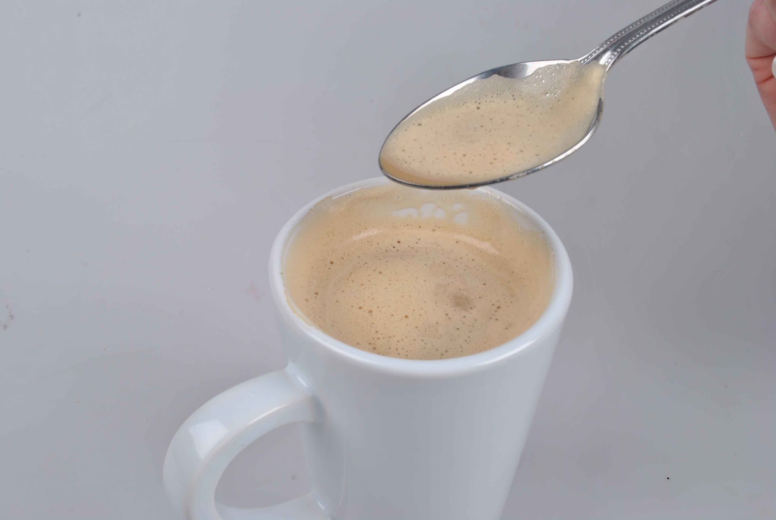
This is an advert for Belvita breakfast biscuits. I like how this photograph has been composed and lit in the studio. This advert doesn't have writing on it which I think would improve the image as an advertisement. I think that this breakfast biscuit is aimed at someone who is on the go and doesn't have time for breakfast, so the 'to go' cup of coffee emphasises that.


I really like this image, I think it has been really cleverly done to make the biscuits look like hay bails. I'm not sure how this image was created - it was either shot separately (the biscuits and the field) and montaged together in photoshop, or the image was a set which had been cleverly made up in the studio. I think the fact that they are in a field is representing what they are made of - this could be a field of wheat, oats or barley etc.


I think this advertisement is really strange and I don't really like the way that the boy is covered in chocolate. I wouldn't like to produce an advertisement along these lines because it could be very messy and ruin the studio.

I like how this image is set up like it is inside a house. I like how the image portrays that children are involved because there are the three childrens mugs out on the counter with the maryland cookies.I like how this image appears to be lit with natural light flooding in through the window.  


I like this advert and when I first heard the breif about biscuits I immidiately thought of the idea of 'getting them before they're gone'. I hadn't thought about the concept of labelling them with post-it notes like in this image.

This image is advertising Helmans Light Mayonnaise and not the biscuit. I really like this advert and I love how it has been lit with a halo effect. I also really like the simplicity of this advert and how the Helmans jar is very small in the bottom right hand corner of the image. I also like how the advert is accompanied by very small writing - I always like this look when it comes to advertising. This advert is fit for purpose because it is advising Helmans Light Mayonnaise and the advert is showing that the biscuit / mayo is so light that you can hold it up with one finger.


These two Oreo adverts both feature a glass of milk which is the trademark way to eat an Oreo. The advert aims to sell Oreo's instead of milk, which is good to see because it makes me think that I can add other things to my advertising photography such as props and set ups to enhance the concept of my advert.


I really love the simplicity of this advert and I like the way it has been lit. I also like how it has been shot on a yellow background which is a bit different to the standard white or black background. I love the concept of this image and I think it's really different and interesting that they have photographed a straw coming out of the biscuit. This shows that it has a milky filling because it looks like a straw you would put in a glass of milk to drink. This makes me realise that you can think outside the box and don't have to go with the most obvious idea that you think of.


ADVERTISING Assignment : CUTLERY : Final images & Review


These are my final images with added text to finish them off as an advertising campagne. I'm not really very happy with my images - I didn't have long to do them and I felt rushed and underpressure and I think this shows within the images. I don't like the lighting in the images and wish that I had spent longer when I was in the studio making the lighting right and having a bright white background rather than having to use photoshop to change a grey one to a white one. I chose the slogan "You won't want to stop using them" which I like because it's simple and makes the images make more sense. My favourite image of all three is the one with the crisps in it. I do see a continuity within the images and together they look like a campagne, I'm just not happy with them as they look rushed. If I was to do this project again I would have wanted more time to plan my shoot and taken more time getting the correct lighting whilst in the studio - if I had done this I think my images would have been a lot more successful.

ADVERTISING Assignment : CUTLERY : Final shoot


Final shoot :


These images are from my second shoot on the concept of wanting to use the cutlery for lots of different things. I photographed the cutlery being used to eat a bar of chocolate, a packet of crisps and drinking coffee. Looking at these images I think that I should have spent longer lighting the background so that it was bright white rather than a grey tone. Since we only had 4 days to do this project I felt very rushed and didn't know how to go about it. i think these images do look slightly rushed and in future projects I will spend more time planning them. I also wish that I had planned the composition more so that I could put the logo in the same place in each image and they would have continuity. From this stage I will need to use post production to make the backgrounds lighter and crop into the images.

ADVERTISING Assignment : CUTLERY : Test shots


Test shoot 1 :


Here are my test shots based on my first idea of photographing cutlery in an abstract way and trying to photograph the shapes in the cutlery. These shots didn't work because I didn't have the right type of lens to create the images that I wanted. I really needed a macro lens to get really detailed shots of the shapes within the cutlery and I don't have one. I think these shots are quite boring and the simplicity doesn't work in their favour. I had a hard time getting the lighting right for these images too because I had very little time in the studio. Seeing these shots I think I am going to concentrate on my second idea of using cutlery for things that you wouldn't normally use it for.

ADVERTISING Assignment : CUTLERY : Drawings and ideas


These are my first ideas. I really like taking photographs of shapes. I've taken photographs of shapes in architecture and shapes in bodyparts. I think it would be really interesting to take close up photographs of cutlery in a macro style and make them look really abstract and make the audience have to work out what it is. I think if they are lit well they could look really beautiful and interesting. I like the idea of photographing a metal egg holder, or zooming right in on a cheese grater and looking at it in an abstract way that will almost make it look like arhcitecture. I could have some cheese coming off it to show it in context rather than making it too abstract. My audience might not know what it is at first then they might notice the cheese and realise that it is a cheese grater. I also really like the idea of getting a close up shot of a forks and focusing on the metal prongs. This would be a really interesting abstract shot and I could use each prong to display a letter of the word fork.


The next set of ideas I have are based on an advertising campagne I looked at in my research where you used cutlery for things that you don't need them for. I would like to interpret this idea in my own way and photograph cutlery being used for eating things such as crisps and chocolate bars which are generally finger food / snacks.


Tuesday 5 February 2013

ADVERTISING Assignment : CUTLERY : Task 1 : Research

Since we are going to be creating an advertising campaign on cutlery, I have chosen to research advertising campaigns about cutlery rather than any random campaign.

Campaign 1 :


This is an advertising campaign for Hackman cutlery  They are advertising a new range of cutlery called "winds". I really like how this campaign is set out in a similar way. In every image the logo is positioned in the same place, and the piece of cutlery is positioned in the same place in relation to the thing that it is imitating. I really like how they have used the name of the product to create a concept. The name of the product is "winds" so they have used a tree blowing in the wind, a boat sailing in the wind and a dandelion blowing in the wind. I like the continuity between these images - if I was to see one of them on it's own in the street I would know what it is for.


Campaigne 2 :


I really like how abstract this campaign is. They have portrayed cutlery in a way that you would never think of, like using them upside down as chopsticks. I especially like the bottom image where at first you think that it is just a table that has been set/laid out with cutlery, plates and glasses and then you notice the foot in the background and realise that it is set on a pedestrian crossing. I think this looks so interesting, and the fact that it is a woman's foot with big black high heels on makes it look more elegant and sophisticated - this says something about the quality and luxury of the dining cutlery and tableware, whereas a builders boot or a trainer would give a different effect. 


Campaign 3 :


This is another Hackman campaign for cutlery. I absolutely love this campaign and think that the concept is brilliant. I really like how the images are simplistic and use similar aesthetics like in the first Hackman advertising campaign I looked at. I also love how the adverts are mainly photographs with a tiny bit of writing at the bottom in a very small font. The slogan says "the more you like them, the more you use them" this is trying to say that you will love this cutlery set so much that you will want to keep using them even for things that you don't need to use cutlery for, such as ice cream, beer and popcorn. I would like to use this campagne as inspiration for my own and use a similar concept and portray it in my own way.


Campaign 4 :


I like how this advertisement shows what is normally a very boring object (plastic cutlery) and turns it into a little landscape scene. If you asked me to advertise plain white plastic cutlery I wouldn't know where to begin and I'd think that it would be really difficult to show them in an interesting way but they have done here. I'm not sure how they got their image to look like this - whether they spent time and effort creating this little scene and photographed it, or whether they photographed each item individually and montaged them together in post production. I like how this is abstract and how it is hard to work out what it is at first.


Campaign 5 :


I like this advert more because I like the product rather than the advertisement itself. I think this shows that the advert is successful because it makes me want the product. I love the way that all the knives fold into each other - this would be appealing to people who don't have much space to keep things such as big knife blocks. I think that the pictures work quitw well together because you might not know what the product does unless you see the knives in both ways. I prefer the top image to the bottom one, and although they are trying to show the knives in context by showing it being used at a dinner party - but I find the things in the image distracting such as the glass of champagne that has been cut off and the curling ribbon that goes off the image.


Campaign 6 :


This isn't a campaign for cutlery but it is one for plates/crockery. I like how they have made a little scene in these images and personified the mushroom and broccoli. I also like how both images have the same aesthetic, like the Hackman ones. I think this will be essential when I create my own advertising campaign for cutlery to keep things similar so people know that they are about the same thing.


Images I like :


I love the simplicity of this image, how the fish is cleanly sliced in half and the use of small font and limited words. I don't think an advertisement, especially a photographic advert, needs a lot of big words. I would like to use a technique like this when I do my own advertising projects.


This isn't an advert for cutlery, this is an advert for a Canon camera. I really like how this has been lit.


I like how simplistic these images are with just the cutlery being used and a white / grey background. I like how they don't need any extras to help with the advertising, they just use the cutlery on their own. I would quite like to take some photographs like this in a macro style and see what they would look like. I love taking pictures of shapes and I would like to zoom in on some cutlery and take some interesring shots of the cutlery in an abstract way.