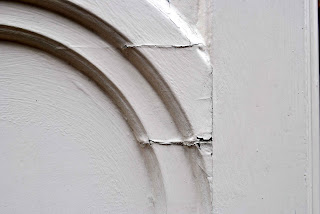
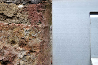
Here are the images that I presented at my mid term review. I printed 4 of my images out and stuck them up on the wall in the classroom. My classmates then discussed my images and how the project should take shape. The overall feedback was they liked the third image because it was very abstract, and because I was aiming to photograph architecture in an abstract way they thought that I should try and go even more abstract. They said that the images on the left and right were too obvious as to what they were - brick walls. I can agree with what they are saying because I do like to make things look really abstract but I like the colours in those two images as they are warmer than the other two. I am going to take on board the feedback from my classmates and try and photograph things in an even more abstract way. I am going to really consider my composition when I am photographing and think outside the box. I may try cropping my images into squares to see if that makes things look more interesting. I have always loved square pictures and think they are really aesthetically pleasing.
Planning the exhibition :
For my exhibition I would either like to display my images on a very large scale and only display two or three images so that they have a big impact on the viewer and they speak for themselves. On the other hand I would quite like to have a fair few images to show for the work that I've been doing over my project and have a grid of lots of different photographs. This would mean cropping them into a square format and montaging them together. I love square photographs so I might be slightly more interested in doing this, but I am going to consider both ways of displaying my images and plan my final exhibition by drawing out how it will look and mapping out different compositions.
Square prints :
Here I have created this layout of how I could display my images if I was to crop them down for my final exhibition. I have used a lot of white space here, and I can't decide whether I like it or not. It could work with the images and emphasise their simplicity, but then again I don't know if it looks too pale and doesn't show the images off like they should be. I have used 9 images here. I'm not sure how many I want to show. I could make them stand alone and display just two or three, or display them like this and have about 9, or I could have lots of images displayed quite small and have 20 or 30 images.
Here I have montaged 16 images together, this time not using any white space. In a way I think this looks more organised than the image above which has lots of white space, but then again I don't know if it looks too cluttered and your eye doesn't know where to look. This might make viewers look closely at my images and study them and look at details, but then again they might think it's too much and walk away and not look at it. It might be quite nice to have all the lines merging into each other from one image to another and all the lines follow each other somehow.
Graphic outcome :
I need to produce a graphic outcome for my FMP. This could be a magazine, a video, a projection, a book, a poster, a banner etc. I would like to produce a book for my graphic outcome. I would like to produce a hard back book to display my work in because this relates to the hardness of architecture and the strong lines and shapes within my images. I want to produce a book rather than a poster or a projection because I have a lot of pictures to display. I really like the look of how the square images have turned out in the images above, so I might create a square book.


