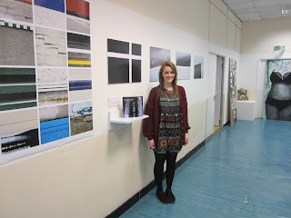
Here is what my final exhibition looked like. I have taken photographs from both ends of the corridoor to get a full view of the images. I am really pleased with how it all turned out and I am glad that I didn't go with my original plan to display one or two images on a very large scale. I am especially pleased with my A0 square tile print. I also really like how the book looks when it is displayed on a little white shelf. It looks very neat, organised and professional.
Here is my large A0 print. I wanted to display a group of photos in a tile format. I decided that I wanted to crop some of my images into squares so that they looked even more abstract. At first I wanted to do a square piece comprising of 9 images. I then decided against this and thought that a long vertical piece would look more interesting. I started placing images into the A0 file in photoshop randomly. I liked that idea but I noticed that some of the lines were joining up from different pictures. I then played around with composition and flipped some of my images to make the lines meet. I really liked the way it was looking so I decided to make them all horizontal even if they weren't originally shot that way. This made them even more abstract. I really love the leading lines on this piece and how the colours all work together. Personally I think that I could have just displayed this in the exhibition alone and it would have looked great. This is my favourite part of my FMP exhibition. I just love this piece and love how all the images link together and how it looks so abstract. I love the colours compared to the other 4 images that I displayed which were all black, white and grey. I could see an image like this displayed in my house or in a foyer of an office building.
These are 3 of the 4 images which I displayed in my exhibition. My initial idea was to display 1 or 2 or possibly all of these on a very large scale (A0 or bigger). I'm glad that I didn't decide to do this because I think the exhibition would have looked too dull. I especially like these three images as they are very abstract and you can't tell what they are. I think they work well in my exhibition and compliment my big print but I don't think they would have looked as good if they were on their own without my big A0 tile print.
Graphic outcome :
Artist's statement :
Here is my artists statement which was displayed in the exhibition. It looks smart when it is printed and mounted on foam board. I think I kept it fairly short and to the point which is what I wanted. I didn't want to go on about what techniques I used and say "I did this..." etc. I think my artists statement looks professional and therefore it worked the way I wanted it to.
Here is me standing with my exhibition. I am very proud of myself for what I've achieved on this project and what I've achieved on the course altogether. I thought that my final major project would be very daunting and be a lot of hard work. There was a lot of work to do but it didn't seem like that because I could choose to photograph whatever I wanted and this meant I enjoyed doing it. Architecture photography is definitely something that I really enjoy, and I will keep on photographing architecture in the future.


