Wednesday, 24 October 2012

ABSTRACT FEAR Assignment : Task 6 & 7 : Exhibit and Evaluate


This was the first side of my installation with the 8 pictures of CCTV cameras and 8 facts to go alongside them. I got these facts from various websites on the internet. I checked lots of different websites to make sure the information i was going to print was valid and up to date. 


I really like how my images ended up being displayed like this with the alternate order of picture, fact, fact, picture. 


This was my first side of my installation. I decided to keep it separate from my images of the girl as the two sets didn't really go together very well and they took something away from each others concept. At first I was just going to display these separately than my pictures of the girl and I was going to display them in a gallery style. Then I thought it would be interesting to display facts with my images to emphasise on the theme and make it scarier knowing how many times we are seen on camera and how many cameras are in the UK etc.


This is what the other side of my installation looked like. I set it up to look like a security room. I recorded lots of different videos of my model and other people walking around York from lots of different vantage points to make the videos look like they were actual CCTV footage. I then edited them together and put them onto 3 different DVDs. When it came to installing my work, I got three small televisions and linked three DVD players to them and played my videos on them. I then set up a table with a coffee cup and a newspaper with puzzles completed on it, a waste bin with some rubbish in it, a chair facing the televisions and a coat on the back of the chair. I then pinned up pictures of the girl with map pins as if someone was taking advantage of their job in the security room and printing out images of a girl they like the look of. This changes my original concept of 'fear of big brother' to a slightly more stalker-ish idea. I only made this decision at last minute but I think it was a good decision to make because it makes the project and installation seem scarier than before. 


I was really pleased with how my videos looked on the screens. The video on the left side didn't actually have a black line on it like in this photograph, it just appears this way because of how I photographed it. I really liked how my model wasn't in every single video and she was only in some, this made the audience watch out for her to see if she's in each video or not. I heard someone who viewed my installation say "how did they get hold of CCTV footage?" this is a compliment to me as it must have really looked like CCTV footage and not that I had just recorded videos from the York Walls. 


Here I had a coffee mug and a newspaper on the puzzle page which had some of the puzzles completed. This made it look like someone was really there in that office. I think it would have maybe looked better if I had used a cup with a coffee stain inside it then it would look more legitimate, however, this would have been difficult and messy for me to transport from home to the space where our exhibition was being held.


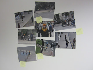
I displayed my images like this with the most zoomed in picture of my model in the centre and all the other ones surrounding it to show who the main character in my images was. Then this would make the audience look closely at the other pictures and notice my models orange hat, scarf and shoes. I think that if I had taken and printed more photos and filled the wall which would have possibly made it look scarier and look like the person who was watching my model had been watching her for a longer period of time.


Here are the three DVD players which I used to link to my small televisions to play my 'CCTV footage'. 


I then decided to add something else to my wall of images with my model on, I decided to add post-it notes to emphasise that someone was really watching my model and interested in everything she did by writing times that she had been seen on post-it notes and sticking them on the walls. E.g. "seen in train station at 14:31"


Overall I am quite pleased with my installation I think due to my planning and organisation it came together well. I chose my theme because the project was called abstract fear and I thought that it was an abstract take on the theme of fear rather than just going for spiders or zombies. I was really pleased with my choice when I saw it all set up in the space along side everyone else's. I think they all looked good together and everyone had approached the theme in a completely different way. I was disappointed when I realised that my two sets of images weren't going to work together because this went against all my plans and threw me off course and put me in a rut for a while as I didn't know how to move forward with my project once I'd realised they didn't work together. I was really pleased that I'd worked out how to incorporate the two projects and display them separately from one another so that my work on the images of the cameras didn't go to waste.  When we were given the brief and were told to do an installation involving lots of different media and video etc I was very worried as I had no idea what to do and didn't like the thought of doing an installation. I wanted to avoid video but when I established my concept of CCTV I thought it would be good to record videos and have them displayed on the small televisions to make it look like a security room. This made me feel more at ease as I had figured out a way of incorporating different medias, techniques and processes into my work. I knew that to take images in the style of CCTV they wouldn't have to be very good quality. I tested a few shots using a very rubbish camera I have to see what they would look like, but the quality was really quite awful so I decided not to use that camera for my final works as I would have been disappointed. I then decided that I should take my images in good quality using my DSLR and then edit them in photoshop afterwards to make them look worse quality. I liked this because it felt like I had more control over the finish of my images and because the images were good quality to start with it was easier for me to make my models orange clothing stand out more and add grain to my images and do it subtly. To create my videos I knew they wouldn't have to be very good quality and since my DSLR doesn't have a video feature I just used a compact digital camera to record the videos. I went into York with my camera and my tripod and positioned myself in various different places on the York Walls. I then asked my model to walk in and out of the shot in various different videos. I really liked how these worked in my installation and I loved how the audience could look at the images of her then look at the screens and then notice my model on the screens and link the two together. I think to improve my installation I could have taken more images of my model and pinned them up on the board to make it look like the person had been stalking her for a longer period of time. I could have also disguised/hidden my DVD players to make it look more like a security room rather than some DVD players linked to some televisions. I asked peers what they thought of my installation and this is what they said :
"genuinely freaky- all those cameras everywhere!" "Brilliant! The angles of the camera and photographs seemed real and it kind of felt live." "I loved the engulfing set up of Liz's installation, it felt like a real office and added to the creepiness of the idea that someone's always watching! The pictures were also amazing, really awesome how she managed to take them like cctv style. Overall; spine chilling."


Tuesday, 23 October 2012

FANZINE Assignment : Task 1 : Researching magazine layouts


Here are a few examples of types of magazines :

- Fanzine
- Art
- Music
- Fashion
- Cars
- Photography
- Sports
- Wedding
- Female
- Male
- Baby
- Horror
- Humour
- Literary
- In Flight


5 Exampls of magazines :

1 : Photography Magazine


The photography magazine that I am looking at is called 'Digital Photography Techniques'. The layout is artistic yet organised and professional looking. Very similar if not the same fonts have been used throughout the magazine. This makes it easier to read and flows better. A lot of photogrpahs have been used in this magazine and some completely fill entire pages with writing being placed on top rather than having writing on a page with an image next to it. Each page/set of pages/section of the magazine has a different layout which keeps the magazine interesting for the reader as they flick through. I like how each article has its own colour scheme and keeps the imagery/headings within that colour scheme. The magazine is printed on A4 high quality glossy paper. This makes the magazine feel more luxurious and makes the reader want to keep it like they would keep a book rather than throw it away like the cheaper magazines or newspapers made from lower quality paper. The magazine is aimed at people who are interested in photography, both amatures and professsionals, to gain tips and tricks about photographic processes and types of photography that are current. The magazine is priced at £3.99 in Autumn 2010.


2 : Programme : Wicked The Musical


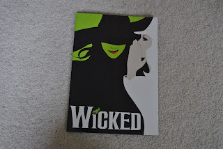
This programme for Wicked The Musical is from when I went to see it in San Franisco in 2009. I can't really remember but I think the programme would have been priced around $15-$20. This is expensive for a magazine but it is the memory that you are paying for when you buy a programme. The paper is very luxurious, more luxurious than the paper in the photography magazine that I talked about above. In the centre of the magazine there is a pull out bit which makes it more hands on for the reader and makes it more interesting, I think this would also attract children to look at the programme. The programme is mainly made up of photographs of the play rather than writing about the play. In fact, apart from an inserted piece of paper with the actors/characters names on and two pages of words from the author of the play, the other 26 images in the magazine are entirely photographic and filled with images. The colour scheme throughout the programme is quite dark as the images have been taken during the play which is quite a dark play and the background in the theatre is quite dark.


3 : Programme : Beacons Music and Arts Festival 2012


This programme is completely different from the Wicked The Musical one that I reviewed above. First of all it is a lot smaller than the wicked one (this being A5 and the Wicked one being slightly larger than A4). It has been made out of quite thick matte paper, different from the super high quality glossy paper which has been used for the Wicked one. Whereas the Wicked programme is made to be kept as a reminder of the show, since this is for a festival, this programme is more to show who is playing at what times and on what stage during the festival. Therefore people attending the festival can work out who they want to see and what times they need to be at a particular stage. The programme features advertisement for other upcoming events in the area which the festival goers may be intreted in. I got my zine for free because I photographed the festival but I imagine that this would retail to people at the festival at maybe £5-£10. The programme has quite small font which at first glance could possibly put off a reader because it may look like there is a lot to read. The zine also features information on the artists who are performing at the festival. Quite muted and pastel colours have been used in this zine.


4 : Brochure : Berry Red Gift Guide 2012


This zine is similar to the last one in it's size being A5. The festival programme was made from thick matte paper whereas this brochure is made from thinner semi gloss paper. Although the layout of this brochure isn't exactly very neat and organised but I really like it like that. I like the way it looks quite collaged and the imges have been layered up like a scrapbook. This is aimed at people who are looking for gift ideas for christmas. I found this on my parents coffee table but I imagine it didn't cost anything since it is trying to sell products. It probably came free with a newspaper. I think I would be interested in styling my zine like this one when I create it.


5 : Leaflet/booklet : Whats going on at Leeds City College


This is a booklet about upcoming events at Leeds City College. The zine features details of plays, exhibitions, performances etc. This booklet is a great opportunity for students to get involved to create photographs/imgery/articles about upcoming things at the college. This leaflet is aimed at students at the college and people in the local area and let them know about things going on incase they are interested in watching any of the plays or going to an exhibition at an art gallery. The colour scheme may suggest that the booklet is more aimed at a female audience because of the pink cover. I think that more females probably will be interested in this booklet than males because generally females enjoy going to watch plays and going to art galleries more than males do.


6 : News Report : Jimmy Saville Allegations


This is a video from BBC News. It was published on the 30th of September 2012. It is about the allegations about Jimmy Saville sexually abusing teenage girls. The video contains lots of different visuals to keep the viewer interested. It has videos playing with people talking over the top, photographs displayed with people talking over the top and interviews with people talking into the camera. I like this style of video because it keeps the audience interested. If the video was simply just someone talking into the camera with no photographs or overlapping videos the audience may have got bored. The video is only one minute and thirty seconds long. This is good because it is short and sweet and the viewer can keep concentrating throughout the whole news report. I aim to keep my video short and sweet as I think this is a better approach and I don’t want people to get bored whilst watching my video which they may be at risk of doing if I make it too long. I think the video is probably aimed at adults as they are most likely to be interested in watching the news and news stories rather than a child.


7 : Video Log : Shopping


This is a video log of someone shopping around the Philippines. The video was published on the 14th of August 2012. It has all been shot using a hand held camera and the clips have been put together using editing software and a soundtrack has been added over the top. In between the clips there are bits of writing inserted to inform the viewer of what the next clip is going to be about e.g. where it was shot etc. I really like how this video has been shot and I would like to shoot mine in a similar style using a hand held camera and panning around rooms and over clothing rails. This video shows that you don’t need a lot of expensive equipment to create a really nice and interesting video. You can see camera shake in this video but I think it makes it more personal and doesn’t detract from the content that the person is trying to show. I think this video is probably aimed at teenagers and young adults – particularly those who are interested in shopping and travelling and seeing interesting things and places. I think this video I more aimed at females than males.


8 : Video Log : Outfit Video 


This is a video log showing what a person wore when they went to Venice or an “Outfit Of The Day” video. The video was posted on the 11th of July 2012. This video is similar to the last one in that it has all been shot using a hand held camera and includes panning shots and close up shots of things. I think this video is slightly more artistic than the last one and has been shot in a more artistic way rather than the last one was shot in more of a documentary way. I think this video will be aimed at a similar audience to the last video because it involves someone showing what they wore to Venice and lots of shots of Venice itself. This means it will be aimed at people who like fashion/clothing and people who like travelling and seeing interesting things and places like the last video. I think the age range will be around teenagers and young adults, and definitely will be more aimed at women than men. There is no talking in this video, just clips around Venice and clips showing what the girl is wearing montaged together with a soundtrack over the top. I don’t think the fact that there is no talking takes anything away from the content of the video because it speaks for itself without needing someone to talk over it. The only thing that I wanted to know as a viewer was where all the items of clothing were from as someone who’s interested in fashion and clothing.


9 : Street Style : What Are You Wearing?


This is a video of a man stopping people in the streets of Norwich and asking them about what they are wearing and where they got things from. This video was published on the 30th of July 2012. I think this video would be aimed at a similar audience to the last two videos I reviewed. It will be aimed at teenagers and young adults who are interested in the latest fashions and what people are wearing. Whereas the last two videos were mainly aimed at a female audience, I think this video will get views from males too as it is men who he is stopping in the video and asking them what they are wearing. The difference between this video and the last two that I reviewed is that in this video the man is stopping people in the street and interviewing them – this is what I would like to do for mine as well as having panning shots with a sound track. I think this may be difficult because one – people may not want to be in a video so it may take me a while to get someone to agree to do it for me and two – it may be difficult because the people will probably be nervous on camera and might take a few takes to get the shot – this will mean my video will take more time to shoot.


10 : News Report : Death of Whitney Houston


This is an ABC News video reporting the death of Whitney Houston. The video was published on the 11th of February 2012. The video contains a man talking into the camera reporting the news accompanied by clips of Whitney Houston overlapping what he is saying. I think that they could have turned down the volume on the clips that overlap the news reader because sometimes when he is talking it is hard to concentrate on what he is saying because the clip of Whitney singing in the background is a little bit too loud and distracting. I also didn’t like how they used the same background clips on repeat so there wasn’t anything new to look at; the audience just had the same clips on a loop. The video is probably aimed at adults rather than children because it’s a news report and children wouldn’t be interested in it.


11 : Property Development : My House - Video by Project 4 Developers


This is a video about when my house went under development and the transformation it went through. The video was published on the 24th of February 2012. The video will be aimed at people who are interested in property development and are considering using the company we used – Project 4. I really like this video because of the panning shots and how smoothly the camera moves around the rooms. I was there when the man shot this video and he had lots of expensive equipment like tripods and moving camera stands to help him achieve this look in the video. The video flows really smoothly because it’s not just my Dad talking for the whole video which may make the viewer lose interest; it has lots of video of my house and the results of the development. This is what the viewers will want to see because they want to know what the potential result would be for their house if they chose to employ Project 4. I think this video has quite an artistic feel and this is the video I am going to use as inspiration for my own video zine. I would quite like to have a mix of shots of clothing rails etc and then insert clips of people being interviewed about vintage style.