Tuesday 29 January 2013

CONCEPTUAL PORTAITS : Final Images & Review


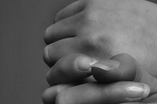
These are the images that I have chosen to send to print. I chose these because they are abstract and feminine. I really like how you can't necessarily tell which body parts they are, they mainly just concentrate on light, shadow and shape. I like how they capture the architectural influence from Bill Brandt, but the femininity from Edward Weston. 


Here are my final 6 images printed and mounted. I got them printed at a place in York called Digital image. I really like their quality of prints and they are a decent price. I chose to get my images on matte/lustre paper 8x10. I then mounted them on white foam board and cut them to size. I really like this effect and think that just mounting them on foam board makes them instantly look a lot better. 

I am pleased with how this project has gone. When we were first set the brief I was a bit nervous because portraiture photography isn't my strongest, and I much prefer taking photographs of architecture. I then found the work of Bill Brandt who photographs body parts like architecture, and I really liked the style. I then was inspired to interpret his work in my own style. I really like photographing shapes, and I did a whole project on photographing shapes in architecture, so thats how I decided to go about my project. I wanted to photograph shapes of the body. The shapes of body parts and the shapes you can create when you make different positions with the body. 

Monday 28 January 2013

FANZINE Assignment : Task 7 : Evaluation

Overall I am pleased with how my project has gone, especially the magazine part of it. I've always loved graphic design so I found myself flowing with ideas for this part. I found it really hard at first to come up with ideas for my video and how I wanted to montage it together. But once i'd got started, and especially after I'd chosen the song for my video montage, it became easier. My video and magazine work well together because they both give information on the same shop - Purple Haze. I was very lucky that they gave me permission to take photos and videos in the shop as a lot of shops don't allow you to take photographs in them for security reasons. They let me stay in the shop for as long as I wanted which meant that I could get all the material I needed in one visit, even though they said I could go back if I wanted. Even though the camera I used for the video part was not the best quality, this didn't really matter for my handheld filming. I took different types of shots - wide ones of the whole shop, close up ones of the materials and clothing rails, and video clips of certain objects in the shop. For a lot of my video clips I used panning to keep it more interesting rather than still images. I think if I was to do this again I would have longer panning shots so I could afford to cut them down and only have moving images, rather than an image that starts off still and moves after a second or two. When I first started to put my video clips together I felt like I needed to use whole clips at a time. However, after watching it through, it was starting to look slightly boring and drag on, so I shortened the video clips right down to every 4 beats of the song rather than 16 beats. I had plenty of clips so I didn't have to repeat anything. This made it a lot easier to keep the viewers attention. Whilst I was in Purple Haze, I interviewed the staff and asked them a few questions. They were happy to answer them for me, but unfortunately they refused to speak on camera. This meant that I had no footage of them to use in my video zine. I then condensed down what they said, scripted it, and asked my Mum to read it out as a voiceover on my video. This gave my viewers a slight break from constant video clips accompanied by a song. The song I chose is called Semaphores On The Lawn by Little Comets. When I was in Purple Haze recording my video footage and taking my photographs, I noticed they played a lot of Little Comets music, including this song, and music similar to it. Since Little Comets are one of my favourite bands, it was easy for me to use this song as I already have the CD to import into Adobe Premiere when making the video. I wanted to use this song because I thought it would make the vibe of Purple Haze come across in the video if I used songs that they actually play in their shop. When I overlaid the audio of my Mum speaking on top of the video, I realised I needed to make the song quieter while she was speaking, to do this I pressed Command and clicked on the yellow line which ran through the song. This made a point that I could move up and down to make the volume higher and lower. I added a few points to fade it in and out so it wasn't so sudden. Considering that I was so worried about doing a video because I've never done one before, I am pleased with how it has turned out. I am more proud of my magazine, though, because graphic design has always been a love of mine. I found it relatively easy to come up with content for the 12 pages of my magazine, due to always reading fashion magazines and blogs. I like my magazine and how it looks quite arty/crafty and not too neat. I like how things overlap, how the images have white backgrounds like they have been cut out and pasted, how the background of my text is coloured and it doesn't look perfect but it works well for the style of magazine.

FANZINE Assignment : Task 6 : Produce work

Magazine :


Video Zine :


Friday 25 January 2013

CONCEPTUAL PORTRAITS : Editing :

I took my images on a digital camera in colour. I then edited them in photoshop to make them black and white and accentuate shadow and highlight.

Step 1: The first thing I did was open the image up I wanted to change in Photoshop.


Step 2: I then duplicated the layer.


 Step 3: I then went to Filter > Blur > Surface Blur. This was to make the skin softer and look more flawless. I wanted to create this effect so that the images looked soft and feminine.


Step 4: I then went to Layer > New Adjustment Layer > Levels. This is to create a levels layer so that I can see where I am erasing to erase the surface blur on the background of the image. I wanted to do this so that the surface blur is only on the skin, not the background, so the skin looks softer and gives the image depth.


I then used the eraser tool and erased the surface blur on the background of the image so only the skin looks soft.


After the surface blur had been erased, I deleted the levels layer as it was just an aid for me to see what I was doing.


Step 5: I then added another levels layer on top of the image, and altered them so that the shadows were really dark.


I then went to Control > I - this creates a layer mask on top of my Levels layer. This mask is black, so I needed to use a white paintbrush to reveal the alterations I made with the levels layer. I want to do this to only show the shadows such as the crease where the legs are bent, the shadows under the fingers etc.


I then used the paintbrush tool and lowered the opacity down so that when I painted onto the black layer mask in white, it would apply it gradually and I could build up the effect as I wanted. 


Step 6 : I then added a curves layer and accentuated the highlights - the opposite to what I did in step 5. I created another layer mask and only highlighted certain areas, such as the top of the hands, the shine on the finger nails, etc.


Here's what my two layer masks looked like when I had accentuated shadow and highlight.


Step 7 : The next step was to make my image black and white, so I went to Layer > New Adjustment Layer > Black and White. I altered the sliders to create the tone that I wanted within the image by adding more red and less yellow etc.


Step 8: The final step is to accentuate the shadows and highlights further. I added a curves layer and moved the curve up and down to create darker shadows and brighter highlights.


Before & After :


I think the before and after look a bit extreme next to each other, the shadows and highlights on the final picture look quite false, but when I see the black and white picture on it's own I really like it and think it captures inspiration well from Edward Weston, Bill Brandt and Horst. P. Horst.

CONCEPTUAL PORTAITS : Different Shoots :

Shoot 1:


Shoot 2 :


Crops from both shoots :


Shoot 3 :