Thursday 21 March 2013

ADVERTISING Assignment : PAPER CLIPS : Final images & Review

 Here are my final three images for my advertising campaign for paper clips. I decided to go with the idea of using paper clips for things you wouldn't normally use them for, but I wanted these things to serve a purpose. For example, using a paper clip to reset a mobile phone is using the paper clip to help you, but attaching paper clips together to form a bracelet or necklace isn't something useful it is just for an accessory. I printed my images A4 (except the web banner which is the width of A4) on matte lustre paper and mounted them using black and white mount board. I created window mounts with a 45 degree angle cutter to create a neat edge and make them look professional.


This is my first advert in my advertising campaign. This one is aimed to be displayed on a bill board. I really like the simplicity of this image. I think if I were to re-shoot this image I would possibly reduce the amount of white space in the image and change the composition slightly. However, I think the white space does make the image look quite clean. 


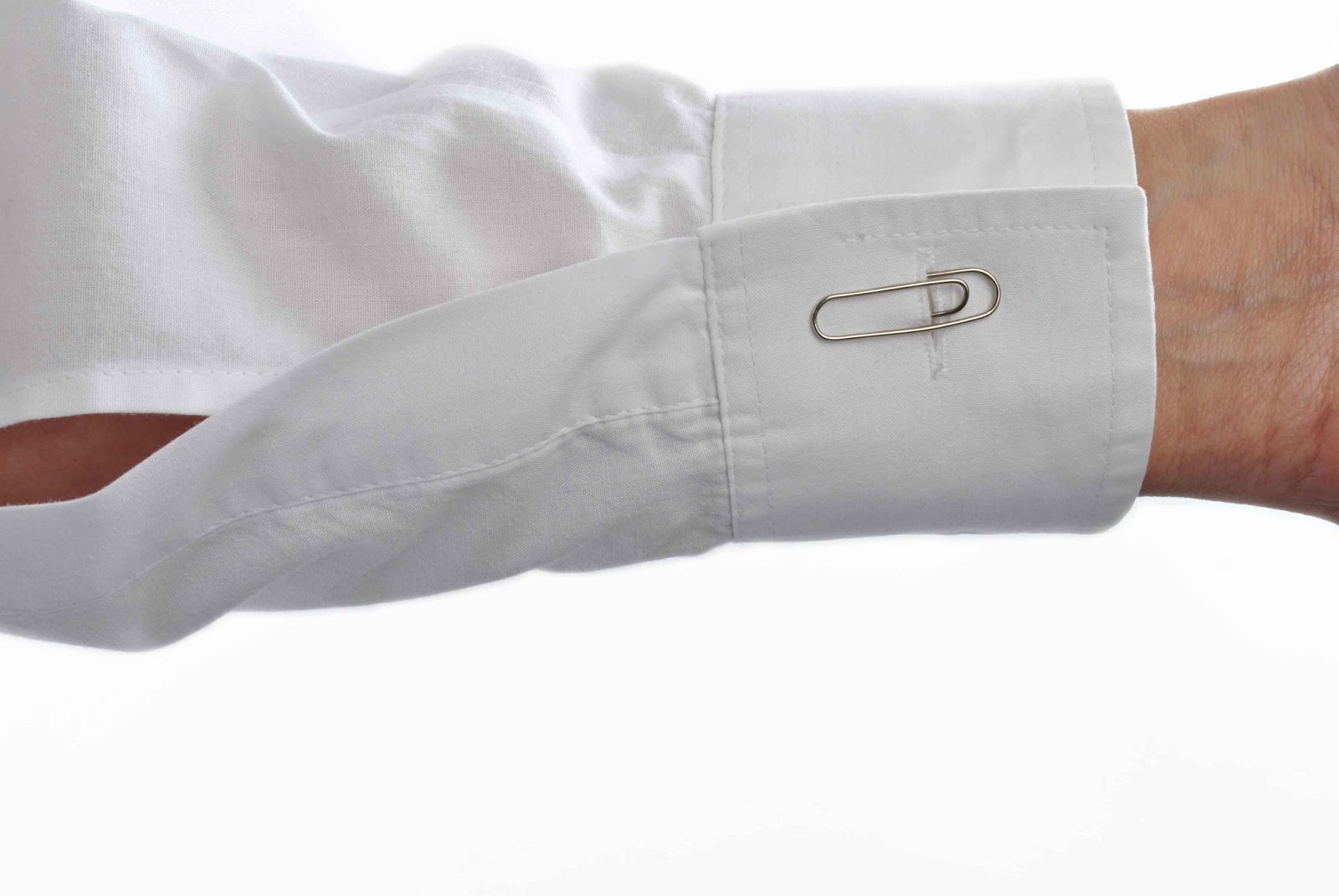
This is the second image in my advertising campaign. This is an advert which would be displayed as a single page in a magazine. I did originally want this to be a double page spread but I thought the composition worked much better in portrait form. I really like the running colour scheme throughout all these images, they are all simplistic with white, black, grey, blue, brown and silver colours. They all look like they belong to the same set and you would notice that they were together if you saw them separately.


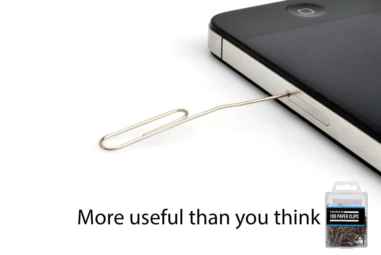
This is my third and final image in my paper clips advertising campaign. This one will be displayed as a banner on a website. I chose to do this because I thought it would look quite abstract to have a close up just or someones head and that's the style I like to use when it comes to my photography. I have done a few projects where I have photographed things quite zoomed in and I really enjoy the outcomes. I have used a similar theme throughout these images and I think it works well because it makes them look straight to the point and are obviously about the paper clips rather than anything else.


I am pleased with my advertising campaign and think the images work well together. Obviously when I had my images printed they weren't printed full size or as they would look fit to purpose. The web banner wouldn't be printed as it would be displayed online and the bill board would be on a much larger scale than the one I have printed. I think the window mounts make the images look even more like a set and I often think that mounting a photograph can make it look 10x better just simply because it's framed. I think my images are fit for purpose because paper clips are a big part of every image and they draw the audiences attention. I was worried that because I used props in the images and I thought that the audience might not be sure what product I am selling. To make sure there is no confusion I added a pack shot of the paper clips in the right corner of each image. Taking this pack shot was trial and error because you'd think it would be easy to take a straight on photograph of the product to have in the corner of an image but I had to re-shoot mine on numerous occasions because the lighting wasn't right or the box of paper clips didn't look full enough or a label on the back of the box was distracting. It really is worth going back into the studio and not just 'making do' with the pack shot because you've got to get the lighting just right before you can be pleased with it. Doing this project has made me realize that there's a lot more to advertising photography than you would think. You think that you'd just take the photograph and compose it so that you can fit writing on the image and add the writing later - but it's a much bigger process than that and you have to re-shoot again and again until you have the image you are happy with, then go into photoshop and edit out every single little imperfection. Looking at an image you may be happy with it, but when you zoom in and look closer you notice tiny little imperfections like marks on the studio background which need cleaning up. When you then think the image is finished you have to sharpen it to make it better quality to be blown up on a larger scale. This process has taught me to take more care with my images and instead of taking thousands of images, taking a few better quality images and spend time on the editing process and making them the best that they can be. 


ADVERTISING Assignment : PAPER CLIPS : Different shoots

Shirt Cuff :


iPhone :


Hair Clips :


ADVERTISING Assignment : Research : Advertising Campains

ADVERTISING Assignment : PAPER CLIPS : Drawings and ideas


Here were my initial ideas when I thought about advertising paper clips. 


Here are some of my advert ideas for paper clips. I really like this idea of using them for something that you wouldn't normally use them for. I like the idea of having the same composition and layout for every single advert like I have drawn above. To create this set of images with the same composition I could create a template on InDesign with a slogan and a pack shot that I can just paste onto every image. All of these are things that show using paper clips for abnormal things except the middle one on the left which is just holding documents together. I probably won't be able to use this idea of having continuity within the images because they can't be all the same size - therefore they can't all be exactly the same layout. I have to produce three different types of advertising such as a poster, bill board, an advert on a bus, a web banner, etc. 


I like these two ideas on the left hand side, showing the paper clips in a work environment. This defines a specific target audience. I think it could look good by specifying a location in which the paper clips will be used and make it look like an office rather than a studio - but this also runs the risk of looking not very professional and looking cluttered. I then thought of an idea of showing the strength of a paper clip by linking them together and hanging something heavy off the end of the chain. I like this concept and think it could produce some interesting results but I don't see why anyone would ever want a really strong paper clip or intend to make chains out of them and hang heavy things off them, therefore I don't want to take this idea any further as I need to believe in an idea before I can work on it. The idea in the bottom right corner of these images is keeping important documents together. This is a really simplistic idea but I think it might be good as that is the general purpose of a paper clip and it might be good to come up with a slogan along the lines of "trust us with your documents" "we'll keep your important things together" or something to show that the paper clip will hold everything together well and won't lose things.


I have chosen to develop the theme of using paper clips for something that you wouldn't normally use them for - and here I have tried to come up with a few different slogans for the series of adverts and see which I think works best. 

Tuesday 5 March 2013

ADVERTISING Assignment : PAPER CLIPS : Research


This is an advert for Volks Wagen. They are a company who make cars so to have a paperclip as their advert is really different and abstract. They have bended a paperclip into the letters V and W. I think this is interesting but I didn't instantly see a V and a W. and think this is because of the top of the paperclip - at first it just looks like a paperclip but when you take a proper look at it you see that it says VW. I'm not sure if I like this image, I think it looks quite dark and gritty and I'm not really keen on the ring of light around the paperclip. 

I like how colourful this shot is. Using coloured paperclips would have made my images for this project look slightly more interesting, however, we are being restricted to using plain silver ones. I don't really like the shadows created in this image, I think for an advertising project the images that I take will need to look a lot cleaner on a completely white background with as little shadow as possible. 


These airplane clips look really fun and interesting. I don't know if the person who made this image has bent them into this shape or whether they were purchased like this. I could bend the plain silver paperclips I use for my project into shapes to make them more interesting than a standard paper clip.  


I think this image is an advert for a hat hook which is shaped like a paper clip. I don't really like this image as I think there are too many distracting things in the image. I think they have tried to make it look more like a real life situation, like a real hat hook in a home or office, but I think the poster, the lamp, the thing behind the hat and the little spikey thing above the hat are all very distracting. I won't be photographing paperclips to make them look larger than they are, but I do like the idea of using a paperclip for something that it's not meant to be used for. In this case, the paperclip has been used to hang a hat, whereas it normally would be used to hold paper/documents together.


I like this image as it is simple and doesn't need anything else in the image other than the paperclips as they speak for themselves. Unfortunately I think I will need something else in the image because we are just using plain silver ones for our project whereas these ones are bright, colourful and interesting. 


Here is another example of using a paperclip for something that it wouldn't normally be used for. I would imagine that this is much larger than a normal paperclip since it's function is to hang clothes on it. I quite like the simplicity of this image however I don't like how dark/grey it is and would like my images to be clean looking and white.


This is a bracelet that someone has made out of linking paper clips together. I like this idea and I think that it is another example of using them for something more than just holding paper together.

Whenever I think of paper clips I always imagine them to be on one of these magnetic blocks. These are generally used in offices to keep the desk tidy as paper clips will cling to them instead of being scattered round a desk. I don't think I will use one of these in my project because the audience might get confused as to what i'm selling - the paperclips or the magnetic holder. I could use a pack shot of a paperclip to make the audience know what it is I am selling - but I really like the idea of using paper clips for things that you wouldn't normally use them for so I am going to expand on that idea more.


This is another car advert made from paperclips. This is from a different car dealership, before the advert was by Volks Wagen, whereas this one is from Toyota. Instead of creating the logo out of paperclips like Volks Wagen did, Toyota have created the outline of a car from one. I think that this is real and not computer generated and someone has taken the time and effort to carefully bend a paperclip into the shape of a car. This would be very hard work and you would need a lot of patience. I like the lighting in this image. 


ADVERTISING Assignment : BISCUITS : Final images and review


ADVERTISING Assignment : BISCUITS : Different Shoots

ADVERTISING Assignment : BISCUITS : Drawings and ideas


My first idea was to have a packet of digestives which was half open with all the digestives falling out. I quite like the simplicity of this idea but it might not be interesting enough and it's probably been done a lot of times thats probably why I thought of it as I've probably seen it before. I then thought of the idea to have a set scene and make it look like someones tea break or something. This might be difficult to create as we have to work in the studio so I would have to bring a lot of props in to make it look like an office or a home. 


Here is another idea for a double page spread with the biscuits stacked up on one side of the page and a dunking biscuit being the focal point on the other side. This might be too much going on in the picture. I really liked my fourth idea of "the nations favourite" and how the advert would show lots of different ways that you could eat/use a digestive biscuit, e.g. a cheesecake base, a biscuit on a tea break, a chocolate tiffin, crumbled over ice cream etc.


I then thought of how I would eat a digestive biscuit - and remembered that when me and my brother were kids my mum used to buy little decorative icings to make them taste nicer and give us something to do and keep us busy by drawing and creating patterns. I really like this idea as it is personal to me and will make the original digestives look a bit more interesting with colour. I then started to develop on my idea of the nations favourite and tried to come up with a different design with blocks of colour. I think this might be difficult as I only have a week to do it because I will need to do lots of different shoots to get everything on the nations favourite advert. 


Here are another two advert ideas for original digestives. The first one is "biscuit o'clock" and I think it would be quite interesting to test my photoshop skills and try and photograph an original digestive and make it look like a clock. My other idea I had was "they won't be around for long" but then again I think this idea has been done a lot.